At this age and at this point in my life, I have been having an internal dialogue when it comes to our personal decorating. On one hand, I look around and think I want to reduce, edit, move on to something smaller and simpler.....less things. Or so I tell myself. I think I might be mistaken after viewing the Junior Leaque of Detroit Showhouse today in Grosse Pointe Shores, Michigan. I need to get my designer head back in the game and shake things up a bit around here. As we toured the Oscar Webber mansion designed by architect Leonard B. Willeke in the early 1900's I am reminded that simple is overrated, at least for me. I love a room or house filled with interest in architecture and design. All those spots that engage you on multiple levels, that tell you a story about the homeowner. On an inspiration level, I always look forward to seeing the gracious, inviting rooms designed by Grosse Point designer Brian Clay Collins. Notice the wood column and urn that pushes the settee end out on a slight angle building in a unique furniture placement (the designer used another column and urn across the room to angle the headboard as well) and warm backdrop with one well-executed angle. See, I just love that. I want to sit here, open a book, nibble a cookie, and have stimulating conversation in this angled setting.
Another intriguing angle was used in the gorgeous kitchen. Birmingham, Michigan designer Phyllis Whitehead used a slender vintage display table (from a department store) as a narrow island. But what made it so interesting was the angled position, sounds odd but looked brilliant. It actually gave more room to the cooking area where it was needed and added enormous interest to the area. Simple white island stools from Target were upgraded with a vibrant fabric skirt.
You should never miss a show house, just for the accessory vignettes alone. I don't know about you but sometimes I get complacent when it comes to my personal decorating and I need visuals to bring me back up to speed and nothing does that better than physically walking through a beautiful show house and seeing a fresh perspective.
One of the best features of an older home is the nooks and crannies. This reminded me that new homeowners should look to add these interesting features into their house plans and carefully look at unique, sometimes smaller window placements. Isn't this vignette charming? I always look to add electrical outlets in kitchen design so the homeowner can take advantage of adding lamps to the kitchen island and counters, it is so inviting at night once dinner is cleaned up and the kitchen settles down for the night.
This stunning and historic glazed blue Pewabic pottery tile was designed specifically for the original homeowner with Mary Chase Stratton when the house was built in 1925. I always think it would be difficult to commit to a colour tile but the iridescent effect was gorgeous and has beautifully stood the test of time. Note the use of smaller windows. Another designer tip? Vanity areas that allow women to sit while they primp and apply makeup in natural light. Much more relaxing............and natural.
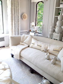
Hollywood glamour in warm white and soft gray. Labeled The Sophisticated Retreat by The Velvet Plum ~ designer Jennifer Duda-Imamura, this luminous room was bathed in glamour and light.
iphone photos by Sande Chase


Love seeing what other designers do. Thank you so much + stunning images. xxpeggybraswelldesign.com
ReplyDeleteThis home is gorgeous! Thank you so much for sharing it. I loved it all and it makes me want to accessorize more also. I love the feathers in the vase and the tea cups lined up on the buffet. Adorable!
ReplyDeleteSande, this resonated with me so much...I am so over this minimalist, editing, down sizing mind set pervading decorating right now.....to me a home speaks of the personality of the one who resides in it, their life and loves, books, china, art and collectibles! These show houses mirror all of that sensibility. We are renovating our 40 year old house, after much thought, rather than move into a new town house or whatever...and I have come under gentle criticism from friends to "get rid of stuff" ! I love nooks and crannies and normal 8 foot ceilings and kitchens that look like they are used for cooking, and my stuff which I have taken great care to acquire.....At any rate, I am rambling.....loved this post....and all taken with your
ReplyDeleteI phone.....amazing! N.xo
Sande, I feel a re-arrange coming on! Have a lovely weekend and don't work too hard.... xv
ReplyDeleteSande,
ReplyDeleteWe are in design show house season and it is a great time to refresh mentally and check-in with what we like and don't anymore. Great way to be in the space to see how it feels and resonates as a home.
"Simple is over-rated" lol.
ReplyDeleteWhile I love 'Simple' when I see it in magazines, blogs, etc., it never quite works for me in my own home- at least not yet.
I love all my 'stuff' too much (even though, in the end, I realize it's just 'stuff')
I am feeling a slight touch of 'a return to cozier settings' in the air.
Then again, it could just be wishful thinking on my part.
Love the blue and white bathroom... looks really great
ReplyDelete